© 2000-2025 - Enkey Magazine - All rights reserved
ENKEY SNC - VAT ID IT03202450924 / REA Code CA253701 - Phone. 078162719
Facebook renews itself with a new graphic. Months after the official presentation, announcements, trial versions for a restricted number of users, the new graphic interface of the most famous social network of the world finally arrives.
How is the new Facebook?
The new Facebook is clearer, easier and more intuitive. After ten years without big changes, if not small retouches, Facebook wears something new with the main purpose to realize an easier interface to use. All of it it’s possible thanks to bigger characters and clearer screenshots, by getting close to a change that is involving everyone.

But this is only a first version of the new interface, so there are still some lacks to fill and bugs to review. A restricted and casually selected group experimented the new graphic of Facebook already the past months, so to understand which are the points that must be checked again.
Now it seems that the social is ready to show itself to the whole world, and not only to that restricted group of users.
But the most important new is the dark mode, such waited and already implemented in Whatsapp. The passage will be slow and progressive. A bunch of users at once. There is already who can choose to pass or not to the new version of Facebook, only by clicking on “Switch to the new Facebook” from the setting menu. But until the end of the year it will become definitive for all the users of the social network.
How can we activate the new graphic of Facebook?
The new graphic will be make available gradually to all the users Facebook, like we said, until to arrive to the complete passage for the end of the year. Many were waiting for a change and they already know what to wonder by the news.

For the end of the year the one just realized will be the predefined interface for all the users. But if don’t want to wait so long we can autonomously choose to pass to the new graphic by selecting “Switch to the new Facebook”.
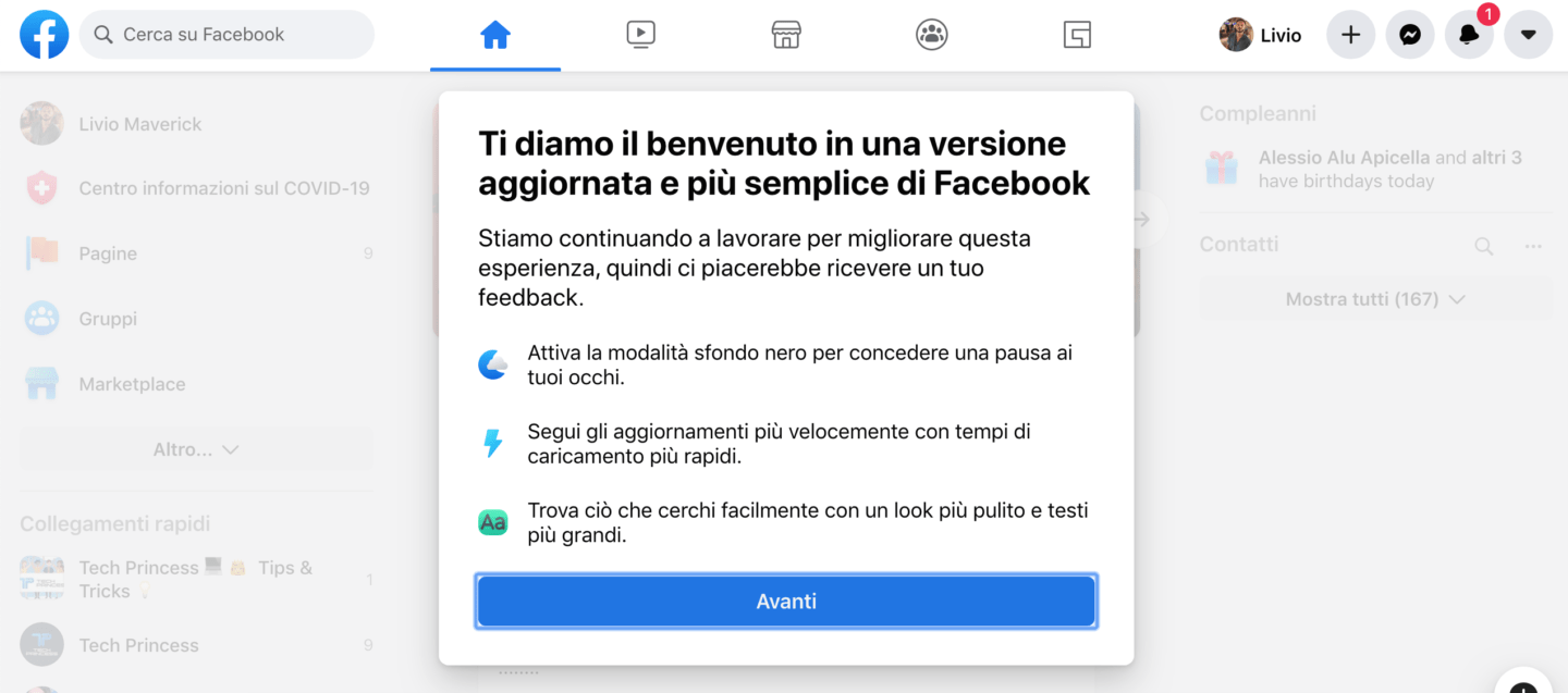
Both if we decide to wait that the slow passage run its natural course or to accelerate the time passing autonomuosly we will find ourselves in front of an introducing page.
It is a series of dialogs where the changes will be shown in a way that the user knows already what to expect and how to browse the new interface.
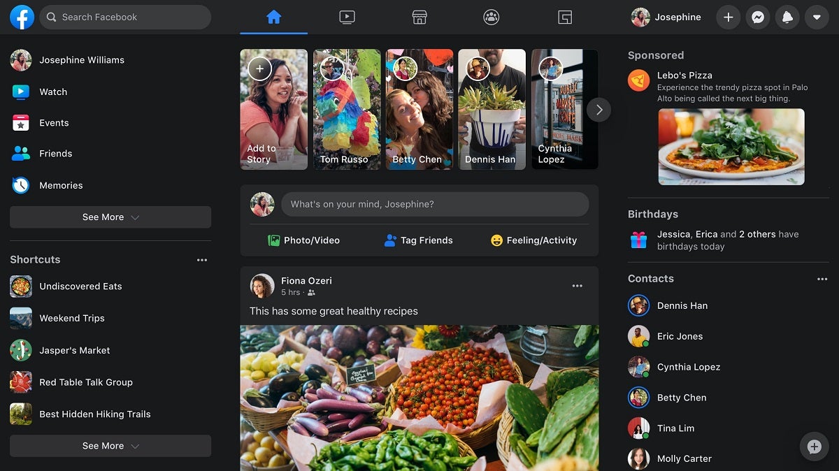
Infact, initially we could get a bit confused by the new implementetions. For example, the stories are more into prominence, it will be impossible that you don’t see them. The search bar it’s been reduced and moved on the side, while on the top there will be some symbols that will guide us to some of the main sections.
Come back to the previous version
Before to decide if you like it or not you must try the black page. One of the biggest new, infact, is right the possibility to pass to the black mode, with darker and less aggressive tones than the classic white. The black version, according to the experts, let the sight feel less tired and it’s so more suitable for the massive usage that we currently do of the social network.

If this new graphic of Facebook doesn’t convince us we can easily come back to the previous version. Like we said, infact, it’s a Beta version.
To come back to the previous interface we just have to click on “Switch to the classic version of Facebook”, which is on the menù. At least until the new graphic won’t become definitive.
While coming back to the Alpha version of the social network they will ask us to fill up a short survey, with a vote from one to five about the user experience, specifying what didn’t convince us about the new graphic.
This post is also available in:
 Italiano


